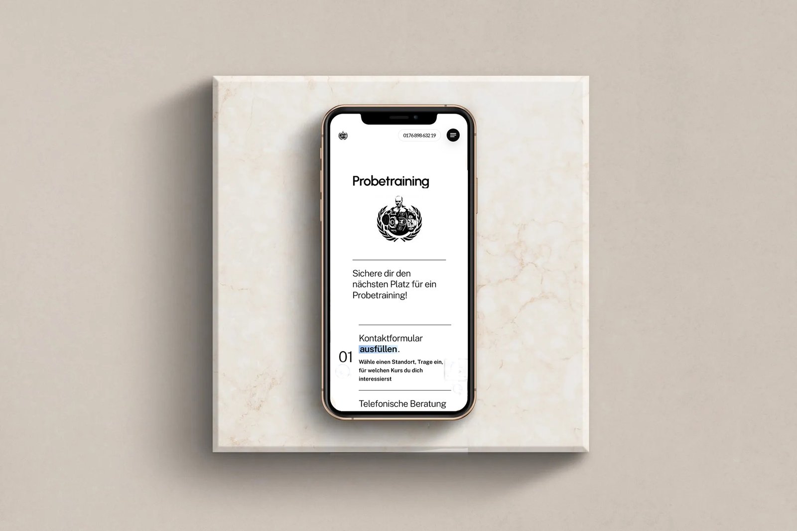
One of the key challenges of this redesign was repairing the high bounce rate and decreasing conversions. A considered user exerience was key to ensure the correct balance of promoting the company brand and explaining key features and services. We
performed a full user experience audit, highlighting issues and opportunities within each section of the site with a view to increasing the rate of conversions.
The website’s ‘call to action’ points are now interspersed in strategic locations throughout the site, helping nudge people in the right direction. Each visitor’s journey from when they first land on the site, to filling in a contact form is accounted for, with emphasis on keeping the journey effortless and concise.


