AMI ,G' CASA GmbH
Mediterrane Feinkost

The Project
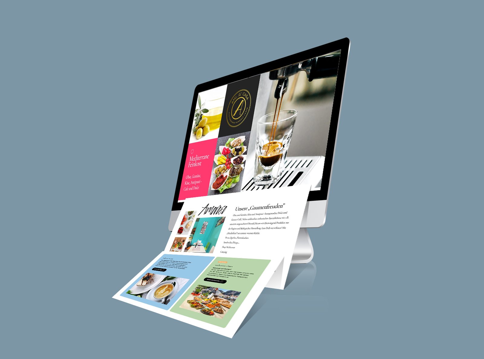
For our client Ami ,G' Casa GmbH , we developed and implemented the new Website, in an attempt to create a more personalised experience for web users.
Our goal for the design was to make it possible to create dynamism, facilitating visitor behaviour by focusing the user’s attention on certain focal points around the site. By containing the width, scale, and colour of each Section and sub-section of content, positively helps users stay visually engaged - we’ve attempted to break the mould, without shattering user expectations.
Redefining for mobile devices
The use of considered and unique font helps Ami "G" Casa messaging stand out, especiallz clear and easz t read on smaller devices. Te colorful, deliberately chosen imagery help lead the user into next sections of the page. These sub sections follow a simple. All in concise manner for mobile device users to easily digest.

UX/UI Design
User Experience
One of the key challenges of this redesign was repairing the high bounce rate and decreasing conversions. A considered user exerience was key to ensure the correct balance of promoting the company brand and explaining key features and services.
We performed a full user experience audit, highlighting issues and opportunities within each section of the site with a view to increasing the rate of conversions.
The website’s ‘call to action’ points are now interspersed in strategic locations throughout the site, helping nudge people in the right direction. Each visitor’s journey from when they first land on the site, to filling in a contact form is accounted for, with emphasis on keeping the journey effortless and concise.


PROJECT SERVICES
8 Weeks
SECTOR:
Mini market & Restaurant
TARGET TYPE:
B2C
WEBSITE GOAL:
generate lead conversions
DELEVERABLES:
UX / Design & Conception / Website Development / Content creation / SEO


